Hamilton area units by Income
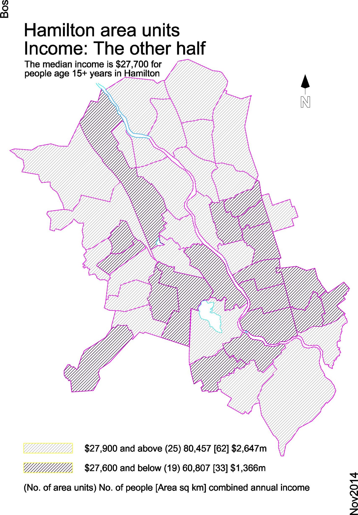
People living in north Hamilton have 2 to 4 times the financial resources of most of the people living east of Hamilton central. However, the city does have an understandable or predictable spread of incomes when comparing the median age in the area units. The images in this post show where the different income groups are choosing to live by looking at Hamilton as 44 area units, and applying a median income to each unit. The first image shows areas where the highest proportion of people have low incomes (dark shading) from areas with higher incomes or more balanced distributions of income (light shading).

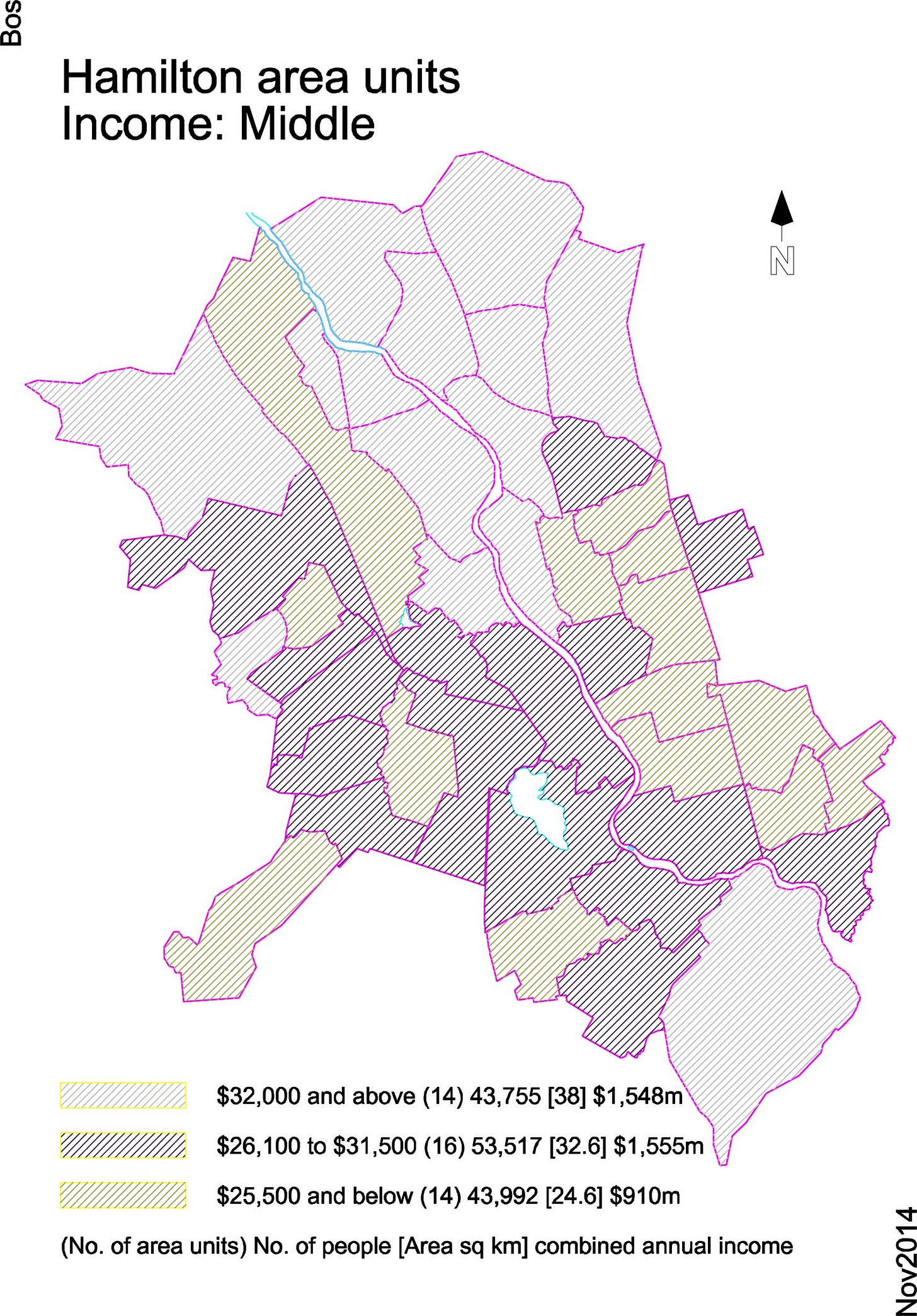
When we add another layer we can see the lower and middle income areas all bordering each other across the middle of Hamilton. Residents in Brymer in the west are in a good position to spend money locally and increase the wealth of the neighbouring areas.

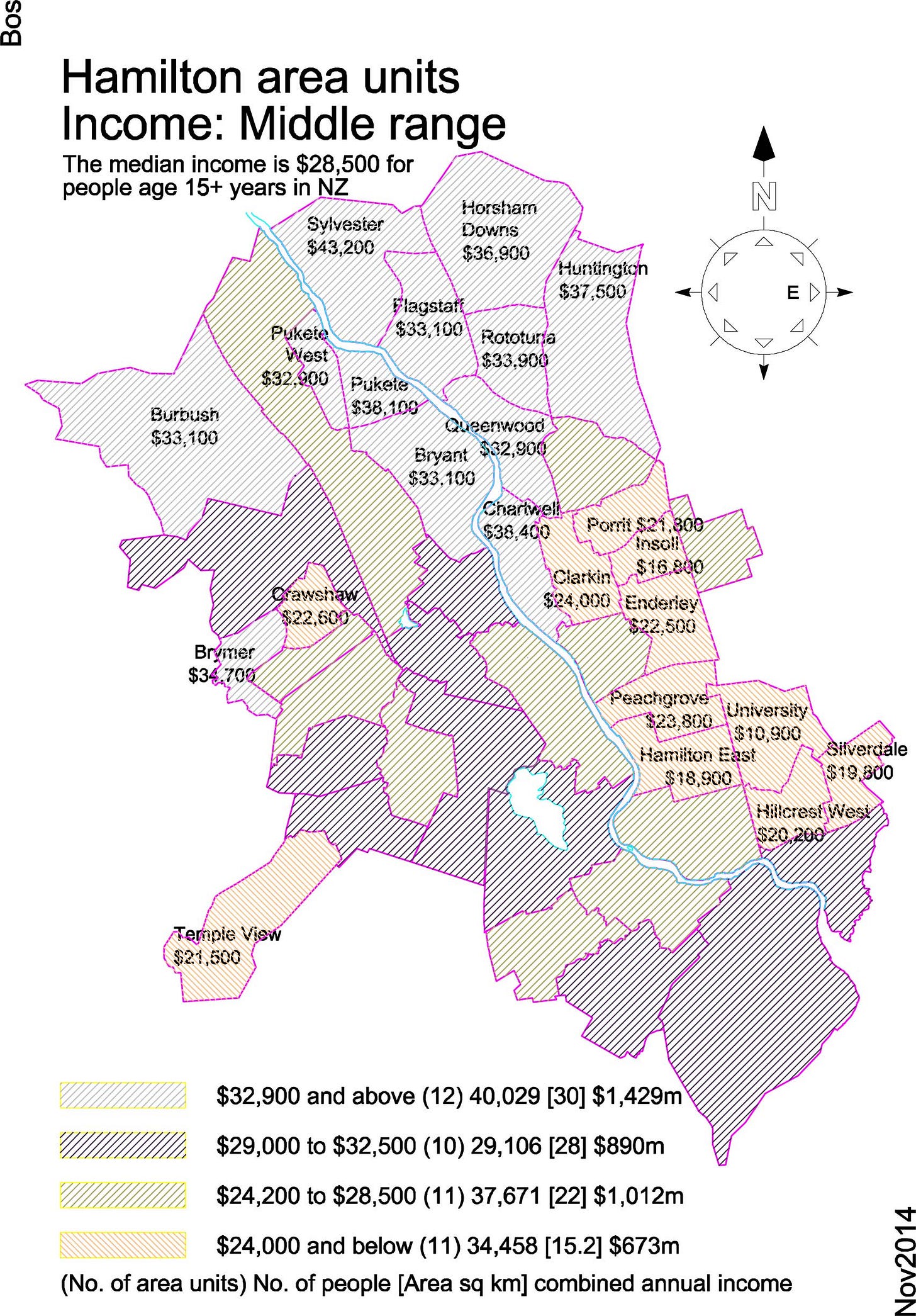
By adding another layer to the image, the city income distribution splits into three income groups: (1) the east of centre is low income; (2) the midwest and southwest of the city look reasonably balanced; and lastly (3) across the north we have the highest concentration of income. Sylvester has 2 to 4 times the income of most people living around the University

Footnote: The source data is from the 2013 census: it does not show change, in terms of what has happened and what is continuing to happen. These are pictures of what we have now. They should be viewed more as demographic art than as serious statistical maps.


